Watercolor Painting on Canvas
Part 1 – Using a commercially prepared canvas
Lately I have been painting more watercolors on stretched canvas…it’s different, challenging and fun. I’ve been experimenting with different surface preparations…some available to use “as is”, others are canvases intended for acrylic and oils that I have done some prep work on. Because I am often asked about the process as well as the experience by other watercolor artists…..I thought I would write it up and share.
The painting that is the subject of this little tutorial was done on a commercially prepared canvas for watercolor made by Fredrix. It is 24” x 36”, that’s a pretty good size for a watercolor, especially for me. The depth is 11/16”. It is available in a thicker version as well. This is what the label looks like…the information on the packaging gives some interesting tips too.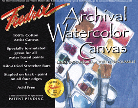
Once I decided on my subject, I needed to prepare the canvas. I chose to paint a scene from a town in Ireland I visited not long ago. Because this is a painting of specific structures, it is important to get the drawing right. I studied the reference photo on my computer, then cropped it to include what I thought would make a good painting taking into consideration the dimensions of the canvas. I put some gridlines on the photo, and also on the canvas in light pencil for guidance in drawing. It does not look exactly like the photo; I made some corrections and deletions along the way.
This is the raw photo.

And this is the cropped photo, color removed and grids added.
I sketched the cars separately on paper and transferred using graphite paper. The more distant one seems too small, even though that is how it did look in the photo. I eventually did enlarge it.
Canvas with Sketch

Next step, carefully wipe down the canvas with water…it does lighten the pencil marks but they remain dark enough to use as a guide. I believe that wiping the canvas removes any excess “size” and allows the paint to adhere better. I have wiped and not wiped, and except for making it look a bit cleaner, it did not seem to affect the way my paint worked on the canvas. I did find that erasing changes the surface of the canvas causing the paint to react differently (as it does w/c paper).
Now I get to paint….I started with some of the roof tops. Watercolor paint reacts so differently on canvas….it is hard to describe. I did some wet into wet in localized areas applying my blues and browns without pre-mixing on the palette. The colors do not bleed into the wet areas as readily as on paper, you have to use your brush more to move it around, but while the brush strokes look very pronounced and kind of ugly at first, they disappear in no time.
I like to apply gesso to select areas to create a textured base for the w/c paints. I applied it to some of the buildings…striving to create a very “old” looking surface. Using a bristle brush I applied it semi-roughly, creating a stucco-like base. The gessoed surface must be very dry before you paint over it with watercolor paints otherwise it will just get milky. Be patient….work on another area of the painting until you are sure it is bone dry.

Over the course of painting this scene I applied gesso to other areas that I thought would benefit from being “roughed up”. This is a close up of the gesso applied to the stone building in the back with some of the paint applied. I find it fascinating to see what the paint will do when applied to a gessoed surface …so much depends on how the gesso has been applied. In this case I wanted it really rough and craggy. When trying to create rocks and stone surfaces, always have multiple colors on the brush at the same time. Some of the paint gets repelled; some goes into the nooks and crannies.
Here is a close up of the stone building in the rear with gesso and wc paint applied.

When using photos as reference, I often refer more to the black and white version instead of the colored one…this allows me to make my own color choices, plus it helps me understand the values I want. There are times I just don’t like the colors in the actual photo anyway. As you can see I made some changes along the way.
Here are more shots of progress of painting over a couple of days of work. My impression when looking at this one is that the whites are too white, and the buildings are not all plumb and the perspective of some of the windows seems off…all fixable.
Below I toned the building surfaces with a warmer white…a little quinachrodome gold goes a long way in warming things up. I also toned that hideous green building down and I enlarged the far auto a bit.


Getting more done now and moving onto the details, plus I still think something is not really plumb. I added wires and darkened and streaked the sky a little. Plus added the markings on the road. 
It is extremely easy to lift your paints when using canvas…which makes it easier to correct mistakes than on paper. The pigment does not get absorbed, so you can wipe or lift it right off. If I put this painting under a spray of water as is, the image would disappear in seconds, with the exception of the gessoed areas.
On to the final touches….I “straightened” some of the buildings…but just a little, they are very old and they earned their right to be a little “off”. I added more wires, and the “calligraphy”…the little touches a watercolorist adds at the very end.
Once I brought it home, I gave it a few light sprays of a gloss varnish intended for paintings. Until you do that, the surface is very fragile and you can lose your painting just by sneezing on it….well…you know what I mean. Once it was sprayed, I then scanned it at 300 dpi and saved the 16 pieces in tif format (my scanner has an 8″ x 12″ scanning bed…tiny!). Then through the magic of Photoshop, it was stitched together to make one very large file. I always save the pieces and the raw file once it is “assembled” as archive. I then flatten it, correctly size it so that it is full size, make any color corrections so that my master file is perfectly matched to the original, and then save that too as archive. These images should never be changed, but copied when I need to make a repro or put on a website, etc.
This is the scanned version…all other images in this tutorial are photos which is why the coloring varies a bit from image to image. You can see how much sharper and more vivid the colors are in the scan. When I scan I compare what I see on my screen to the original to make sure it is as close to being an exact match as possible. Occasionally I have trouble with some greens and blues, but most of the time I can get it close to perfect. 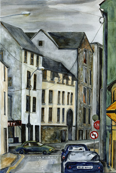
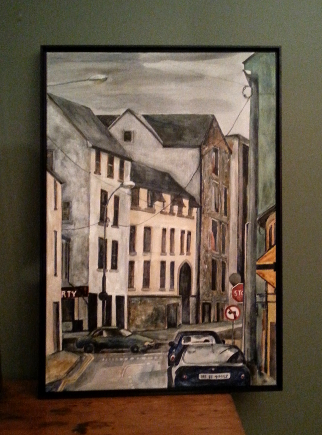
Next step, I will sign it with w/c paint and then apply another coat or two of varnish (making sure the sides are sprayed also). I know that stretched canvas, those with “gallery wrap as this one has, don’t need a frame…they can be wired and hung as is. But this one is not all that thick and looks better in a simple black floater frame.
And voila (a photo) … my painting of yet unnamed Irish town in a floater frame.